Welcome to Software Development on Codidact!
Will you help us build our independent community of developers helping developers? We're small and trying to grow. We welcome questions about all aspects of software development, from design to code to QA and more. Got questions? Got answers? Got code you'd like someone to review? Please join us.
Post History
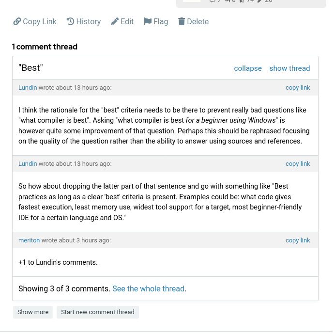
See this picture How do you answer in that thread? Hmm, there are two buttons. One says "show more". I click on that and the thread collapse. Is that "more"? Ok, so I click on the thread agai...
#1: Initial revision
Suggestions for improving the UI regarding comments
See this picture  How do you answer in that thread? Hmm, there are two buttons. One says "show more". I click on that and the thread collapse. Is that "more"?  Ok, so I click on the thread again to get back to the first picture. There's one more button to try. "Start new comment thread". Weird phrasing, but that's the only option. And it opens up a box where I can write a comment, so it has to be it. Wait what? It DID start a new thread? Ah, I see, I should have ignored both buttons and instead clicked on "show thread" on the top. Ah, finally. What I'm trying to say here is that this is a bit confusing for a new user. It's quite easy to learn, but it's not intuitive. Here is a proposal: - Just as it is now, underneath the post it should be a list of threads. - When clicking on a thread, the other thread titles should NOT disappear. As long as it's less than 5-6 threads, this should not be a problem. Right now, when you click on show more, you come to a new page where the post and parent are in expandable fields on top. I LOVE that feature. But I think it could be improved. Btw, this is what I'm talking about:  So to continue my proposal: - Have those "Parent" and "Post" buttons on the main page too. Or simply don't have separate pages. When you click on a thread, an animation could collapse those two, giving a very clear indicator of what's going on. I'm saying this from the perspective of a desktop user. I have no idea if this is doable or a good idea on mobile.


