Welcome to Software Development on Codidact!
Will you help us build our independent community of developers helping developers? We're small and trying to grow. We welcome questions about all aspects of software development, from design to code to QA and more. Got questions? Got answers? Got code you'd like someone to review? Please join us.
Comments on How to add vertical lines for visual separation in pandas plot
Parent
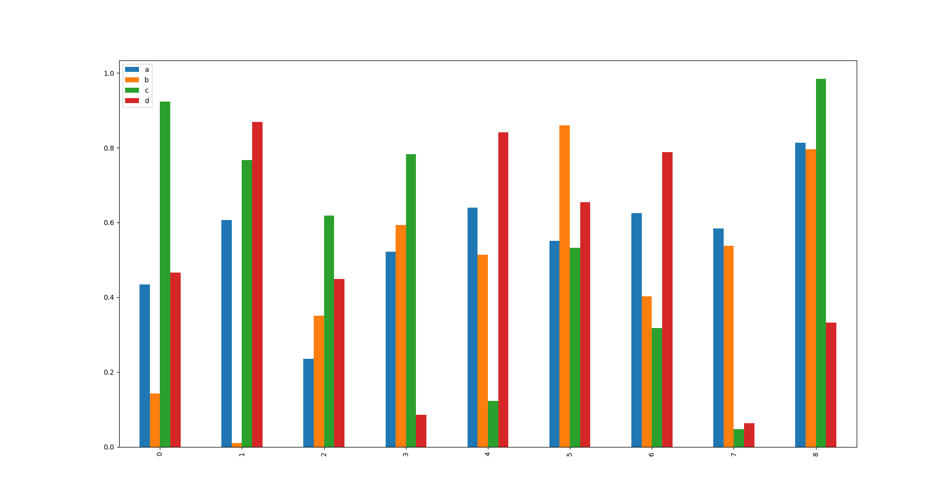
How to add vertical lines for visual separation in pandas plot
MWE
import pandas as pd
import numpy as np
import matplotlib.pyplot as plt


df = pd.DataFrame(np.random.rand(9, 4), columns=['a', 'b', 'c', 'd'])
df.plot.bar()
plt.show()
Question
How do I add separating vertical lines between groups? Say these are
groups of three:
(0, 1, 2), LINE, (3, 4, 5), LINE, (6, 7, 8)
Notes
This really helps for recognizing patterns and tracking trends in a busy, but useful graph.
Post
I don't think this is possible using just the Pandas plotting API. You can use the lower-level Matplotlib API to do just about anything you can imagine:
ax = df.plot.bar()
vlines = [2.5, 5.5] # x-positions of the group separators
ax.vlines(vlines, 0, 1,
        transform=ax.get_xaxis_transform(), # [1]
        color='black',
        linewidths=0.8) # [2]
# [1]: This makes the above 0 and 1 refer to the top and bottom
# of the plot, regardless of the actual scale used for the data.
# [2]: 0.8 is the default width used for the axis frame
# (matplotlib.rcParams['axes.linewidth'], if you prefer).
plt.show()
ax here is a Matplotlib Axes object, and you can read about all the things you can do with it here.


0 comment threads