

















Welcome to Software Development on Codidact!
Will you help us build our independent community of developers helping developers? We're small and trying to grow. We welcome questions about all aspects of software development, from design to code to QA and more. Got questions? Got answers? Got code you'd like someone to review? Please join us.
How to make the text box such that its placeholder goes up and arranges itself in the centre of the border upon clicking?
How to make the placeholder so that it goes to the top of the border line on click?
For example, when you go to Gmail and click on the input field, the placeholder text goes up and arranges itself to the left and in centre of the border-line. Here are screenshots of what I mean:
Before clicking:

After clicking in the box:
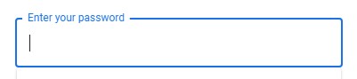
The placeholder text ('Enter your password' in this case) goes up smoothly as you click in the box.
Unfortunately, I'm not fluent in programming enough to do that myself. The best I could do was this, but it doesn't work:
<!DOCTYPE html>
<html>
  <head>
    <style>
    input[type=password] {
        width: 100%;
        padding: 12px 20px;
        margin: 8px 0;
        box-sizing: border-box;
        border: 1px solid #cccc;
        -webkit-transition: 0.5s;
        transition: 0.5s;
        outline: none;
    }

    input[type=password]:focus {
        border: 2px solid blue;
    }
    </style>
  </head>
  <body>
    <form>
    <input type="password" id="pass" name="pass" placeholder="Enter your password">
  </body>
</html>
Can anyone show me how I could do that? I would like to do it with CSS and HTML only, but JavaScript would also suffice.

1 answer
The basic ideia is to create an input with a "fake" placeholder, and a span that will serve as the actual placeholder text. Then you group both inside a label, like this:
<label>
  <input type="password" placeholder=" ">
  <span>Enter your password</span>
</label>
Note the input's "fake" placeholder (just a single space). We'll use it just to know when the placeholder is being displayed or not (such as when you click in the input field - in that case, the placeholder disappears so you can type). To detect when the placeholder is being displayed, we're gonna use the placeholder-shown pseudo-class.
The actual placeholder text is whatever it is inside the span, so we just need some CSS adjustments to place it where we need:
label {
  position: relative;
  display: inline-block;
}

span {
  padding: 10px;
  pointer-events: none;
  position: absolute;
  left: 0;
  top: 0;
  transition: 0.4s;
  opacity: 0.5;
}

input {
  padding: 10px;
}

/* When input is focused, or the placeholder is not being displayed, change the border to blue */
input:focus, input:not(:placeholder-shown) {
  outline: none;
  border-color: blue;
}

/* When input is focused, or the placeholder is not being displayed, change the placeholder size, position and color */
input:focus + span, input:not(:placeholder-shown) + span {
  opacity: 1;
  background-color: white;
  color: blue;
  transform: scale(0.75) translateY(-65%) translateX(-20px);
}
We use input:focus and input:not(:placeholder-shown) to know when the placeholder must be moved to the top (the former is for when we click on it, the latter is for any situation when the placeholder is not being shown, such as when there's something already typed in the input field, regardless of its focus).
In those cases, the input changes its border color, and the placeholder (the span content) is moved to the top (translateY and translateX), with a smaller size (scale(0.75)), and I also change its color - and the background color, so the text is shown over the input border.
And you can also play with the transition values to control how the placeholder is animated: the 0.4s is the time it takes to move from/to the top (0.4 seconds), and there are lots of other options available, to achieve different effects.
You can see this example running here.


0 comment threads